


Why do some websites do better, while others fail to gain good conversion even though money and effort had been invested in development? There is only one difference: the successful and popular ones are designed in a way that they are user-friendly, i.e., they have an appealing UX design.
While we cannot ignore the importance of SEO, PPC, or any other marketing strategy, let’s admit that the ultimate factor that can determine the success of an e-commerce website is its user experience.
You can bring your potential customers to your website using different marketing strategies, but if your website has UX mistakes, nothing can make them stay there.
To be honest, even with all the advancement, which we can see in e-commerce website designing, it is sad to see how some companies let their conversion rate go down the drain with some basic UX mistakes that are very much avoidable in the first place.
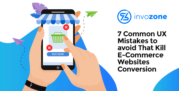
Let’s have a look at the basic 7 e-commerce web design UX mistakes that you can avoid to have a good conversion rate.
Fine, you have to list everything that your website is offering to sell, but during that process, don’t make the navigation too messy for your visitors. They might get lost and never return. This is an alarming situation for any website. To solve the issue, you can add a chatbot for responsive customer interaction. A responsive website multiplies its conversion rate in no time.
The best e-commerce website design aims at creating an easy to navigate, simple UX design that makes users stay. The satisfaction of your customers eventually becomes your most valuable business asset, and for this, user engagement is necessary. To achieve this, a fluent navigation experience is key. If going through your website requires technical browsing skills, whatever effort you put into uploading good photographs of your products on your website, it is going to be wasted.
Here are a few things to check when you optimize your e-commerce web design to improve navigation.
- Your search bar should be prominent
- Your menus should make sense to your target audience (Target coherence, cohesion, and clarity in text)
- Your website should categorize products. Also, it is beneficial to offer filters for a quick search of desired products.
- Your website should show the overall path. For this, you can use Breadcrumbs. (As it worked for Hansel and Gretel, Breadcrumbs on a website lead your customers to the right products hassle-free).
2. Ignoring Disabled Visitors
A friend of mine, who has a special case of vision impairment, complained to me about a very famous brand’s website that is offering no facilities on their website regarding disabled user experience. This led me to do a little research of my own. I landed on this 2019 Disability Statistics Annual Report by the University of Hampshire, which states that 12.5% of the US population is suffering from a disability, in one form or another. Vision impairment comprises 2% of it.
If your website’s user experience design keeps this in consideration, it is not only going to show your company’s compassion towards the less privileged but also can bring certain advantages to your company (one of which can be a good conversion rate). So, it is always beneficial to make your website’s UI and UX design customizable so that users can select their desired colour contrast and font size. Don’t forget to add a description (ALT) to any videos or photos that you add to your products. This will make them legible for people who use vision impairment helpful software to navigate through your website.
3. Missing White Space
A messy website that is cluttered with pictures and text can turn-off anybody. Imagine if your website does this to your potential customers (I know! The horror of it!). White space induction on your website is the same as giving some virtual breathing space to your website users. This makes the important stuff more visible, enhancing the chances of attracting the customers.
Here are a few tips to make your website more appealing visually:
- Use bullet points instead of long, chunky paragraphs
- Add blank spaces between different designing patterns you use on a page
4. Delay in Loading
In this era of instant gratification, nobody can wait for hours (read: minutes) for a website to load. While high-speed internet facilitates increasing the number of visitors to a website, it also provides them with an option to move on to another one if one’s loading is delayed. This can even deprive your content of the chance of being seen. This way, you can miss out on conversions.
Here are a few tips to try in case your website is running slow.
- Optimize images
- Minimize HTTP requests
- Use plugins
This will not only save a few precious seconds while your website is loading, but also will improve your eCommerce website’s UX user experience.
5. Not Optimized for Mobile
Every e-commerce web design company focuses on keeping itself updated with the latest trends in the market. Take an example of how Shopify web designers work at building the latest mobile-optimized apps to facilitate users from all age groups. This in itself is disappointing that it is 2020 already and you can still find a user interface designer who did not optimize his designed website to be accessed by mobile phone users.
The point? Don’t make it difficult for your customers to reach your store, and especially when they want to do it from the comfort of their homes. Many websites also offend customers by forcing them to download an app to properly use their services, instead of giving them easy access to their website on their mobile screens too. This generation’s mobiles are already cluttered with enough apps. Make it easy for them to access your website in as few steps as possible.
6. Low-Quality Content
The products you sell on your e-commerce website must be pleasing to the eyes, but most e-commerce web designs ignore the fact that the written content is actually, what describes the product to the customer. No picture is going to make it possible for a customer to buy a pink mug (for instance) if the content hints at it being blue. It is going to create confusion in the mind of your customers, hence, resulting in delaying the purchase altogether. Your website’s “About” section is as important as the product page. Once your customers relate to your brand’s digital presence, it works as a CTA to convince them to buy from you.
Here are a few tips to make your website’s content work in your favor.
- Your headings should be catchy
- Use conversational language in your description to trick your customers into believing that they are having a one-on-one user experience on your website.
7. Complicated Checkouts
When I go to an e-commerce website and it asks me to fill lengthy forms, it reminds me of the old times when people had to go through tiresome clerical processes to get things done. Needless to say, I leave.
Do your customers a favor and make your checkout as easy as Amazon’s one-click checkout. You can exceed the limit to 3 clicks, but that must be it.
The checkout process could go as smoothly as:
- Click the product
- Click the Checkout button
- Fill in your information
- Click Confirm to complete
Adding too many clicks can frustrate your customers. Keep the click count to the lowest possible to retain and sustain them.
Conclusion
There is no rule to attain a perfect UX design, but by avoiding the mentioned above mistakes, you can improve your website’s conversion rate. Even if it doesn’t with improving conversions, you will know for sure that you can’t blame your UX for the fault.
Author Bio:
John Smith is a digital marketing expert and working in reputed software development agency InvoZone. He has helped several brands grow from nothing to a successful name in the past few years. He believes smart work and business values go a long way when it comes to success.