


A/B testing involves presenting two variants of a marketing asset to different audience segments simultaneously to identify the variant that drives more conversions.
This could be something like two versions of landing page layouts. One group of your web visitors get to see one of your test variants, while another group the other. In the end, the variant that performs better is used as your website’s permanent landing page.
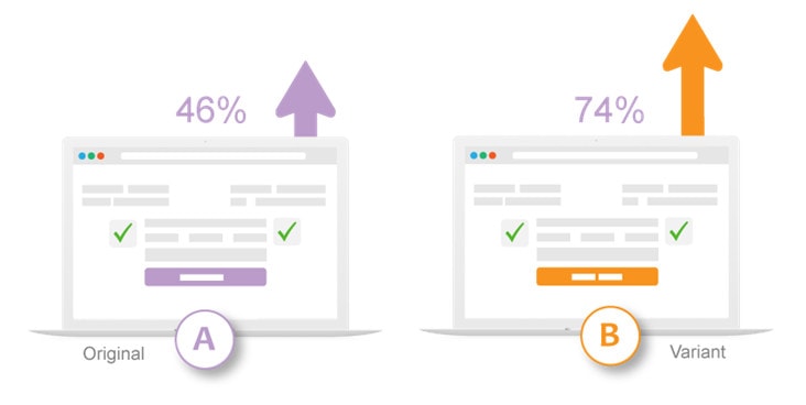
A/B testing enables you to make the most out of your audience and helps you increase conversion without spending a fortune. Even with the smallest changes, A/B testing can significantly increase conversions and heighten your ROI.
This blog gives you an overview of the different elements you can A/B test to improve conversions.
- Headlines and taglines
The first thing that people view once they enter your web page is its headline. A study says that 97% of web visitors take time to read the headline. They judge the content below and decide whether to read on by looking at the headline.
So, headlines and taglines should be catchy enough to impress the visitor and grab his attention as soon as he enters the page. You may try two variants of short, crisp, and to-the-point headlines or taglines if you are doubtful.
Csek Creative, a digital agency, A/B tested its tagline on its homepage. One variant read, “Csek Creative is a Kelowna based digital agency that delivers the results that make business sense.”, and the other read, “Csek Creative is a digital agency that helps companies with their online and offline marketing needs.”
The second version was shown to increase click-through rate by 8.2% than that of the first. So, the firm used it on their permanent landing page copy.
- Decks
The one or two-sentence summary given under the headline is referred to as a deck. 98% of people read these before they move on to the main body of the content. So, you may two best-written decks using A/B testing to know which one performs the best.
By incorporating story-telling into your deck, you can increase conversions. For, studies say that messages delivered as stories are up to 22x times more memorable than stats. So, let your deck copy be something like, “We are known for our design and software. 80% of our customers were extremely happy with our design, and 72% were extremely satisfied with our software.”
- Body copy
Be prudently watchful about your website’s copy, its writing style, and formatting. Let it be short and to the point while conveying your offers and its benefits. Different paragraph lengths, fonts, font sizes, level of persuasions, content depths, CTA buttons, anchor texts for your CTA link, etc. can have a say. So, use A/B testing to try two close variants of elements you are unsure of.
HubSpot A/B tested the CTA for Performable, a marketing automation company, and found that the red color CTA surpassed the green one by 21%. And in its A/B testing for Matthew Woodward, an award-winning internet marketing blog, it found that blue links beat the pink and red ones in driving engagement and conversion rates.
The colors and other details vary from industry to industry and even from company to company. So, A/B tests the parameters for your website.
- Rich media
Today using SEO-optimized text alone will not work. You need to include images, video, audio, GIFs, infographics, and other engaging content in your copy. These naturally draw viewers’ eyes toward themselves. You can A/B test infographics against images or GIFs or video testimonials against written ones to know what your audience responds well to.
Discovery Communications, the renowned American multinational mass media firm, A/B tested two variations of their video preview image to find the one which drives more engagement. While one of the variants provided a static image preview, the other panned across still images, creating a sense of motion (referred to as the “Ken Burns Effect”).
They experimented with 20,000 visitors. The results showed that the Ken Burns Effect increased the click-throughs by 6%.
- Email subject lines
The subject line of an email has a direct influence on its open rates. The receiver needs to see something that he or she likes in the subject line to open it. Recent studies say that the average open rates range from 25 to 47 percent. Even the above average emails are opened by only some 50% of receivers.
To increase the open rates, you may A/B test different subject lines. You may try attractive words against one another, questions against statements, personalized against standardized, emojis against no emojis, discounts against urgency, and so on.
Light Stalking, a renowned blog and forum for photography, A/B tested two email subject lines to know which one worked better. They created two identical versions of the same email, but the subject line of one read “The Weekly Challenge is Live. By using it, Light Stalking was able to increase its web traffic by 83%.
- Product descriptions
Product descriptions are often preferred short. Easy to assimilate, simple, and brief content that highlights a product works well. However, for more complicated products, say a dress, people look for more details like the sizes available, colors available, stitch, fabric, finishing, weight, neck shape, sleeve length, washing and pressing instructions, and more.
So, test short descriptions against longer ones to see which converts better. You can also test your product description design. For instance, you may try paragraph copy against bullet points.
Zalora, a fast-growing online fashion retailer in the Asia-Pacific, used A/B testing for optimizing its product page layout and highlighting its free delivery services and free return policy, which the customers were unaware of. They tested two layout variants over a significant period and found that one of the variants outperformed the other and the control. When the outstanding layout was launched, it increased the e-commerce business’ checkout rate by 12.3%.
- Social proof
Online reviews affect purchasing decisions in a significant way. So, you would benefit by displaying social proof on your product pages, landing pages, and other marketing assets. However, it would be best if you showcased these in a manner that appeals to your audience. To know what fascinates them, you may A/B test testimonials against star ratings, static image accompanied quotes against video testimonials, etc.
ComScore, an American media measurement and analytic firm, A/B tested logos of its happy customers against their written testimonials for providing social proof on a product landing page. The test results revealed that displaying customer logos increased leads generation by 69%.
- Landing pages
You can A/B test your landing pages to understand what brings sale, converts more, drives more user engagement, etc. Thus, you would get to comprehend your visitors better and avoid getting crushed by the competition.
You can A/B test the landing page’s layout, your offers on it, the links on it, the navigation, etc. You may see dramatic differences or just small variations in the website conversion rates. You can use the hard data thus received to come up with your permanent landing page.
Crazy Egg, an online analytics application for digital data visualization tools, ran an A/B test on their landing page to find whether a long- or short-form page would bring more conversions. They found that the longer one outperformed, the shorter one by 30 percent as their visitors sought more information about their tools to make an informed decision.
Another instance is Ubisoft Entertainment, a reputed French video game company, getting fewer leads and conversions. After investigating the matter through website heatmaps, click maps, web surveys, and scroll maps found that their purchasing process was too tedious. So, they completely reconstructed their Buy Now page. They simplified the entire buying process and reduced the up and down page scroll.
The firm A/B tested this new version with the old version for a considerable period. The results showed that the new one brought 38% to 50% conversions and increased the lead generation by 12%.
- Lead forms
Lead forms or lead capture forms are those online forms you find at websites. These ask you for your personal information. These can be newsletter signups, registration forms, or contact forms. You can A/B test two versions of such forms to know which format allures your visitors into signing up with you.
Secret Escapes, a members-only British traveling firm, A/B tested two different versions of their mobile signup pages. One required mandatory signup, and the other was an open gate. They found that the mandatory signup gate worked better. Upon launching the same, they generated doubled conversion rates. Additionally, it did not generate any negative comments or reviews.
- Customer preference studies


Getting to know your customer preferences is the first step towards successfully marketing your products and/or services. Rather than guess working, you should determine their preferences based on solid data. Here you can use A/B testing as your market research tool.
Unbounce, a leading landing page building platform, employed A/B testing to know whether its customers preferred sharing their email address with them or would go for tweeting about one of its products. One variation of its landing page asked users to share their email id in exchange for an ebook. And the other asked them to tweet as a trade-off for the same. The results showed that users chose the former as it brought a 24% increase in conversion.
A/B testing can help you affordably make the most out of your audience. Just take some inspiration from the examples discussed in our write-up. However, do not blindly pick any element for A/B testing. Go for analytic data before you start testing. This can help you effectively employ A/B testing to understand your customer preferences, know what sells, driver user engagement, increase conversions, and thus, increase your bottom line!