


Integrating embedded analytics into products helps you add more value to your offering. Essentially, you’re empowering users through easy access to a wealth of data and analysis to gain insights and make decisions.
By using an embedded analytics solution instead of building your own, you can guarantee streamlined integration with your app and reduce time-to-market. The best part is that you don’t need to provide ongoing maintenance and support for the analytics module yourself, because you’ve basically outsourced that to specialist solution providers.
Sisense’s Embedded Analytics solution is an open, API-first platform that lets you build and infuse custom analytic apps in any product. This way, you can provide customers a competitive edge and open up new revenue streams.
In this article, we’ll explain how you can add more value to your products by integrating Sisense’s embedded analytics solution.
Step #1: Jot down use cases that could benefit from data visualizations
Businesses generate huge volumes of data on all sorts of metrics, spanning from marketing performance and customer interactions to inventory levels and sales revenue. Sifting through all this data to gain meaningful insights quickly becomes challenging.
Data visualizations help businesses transform that data into usable business information. It makes it easier to see KPIs more clearly and apply analytics to reveal significant relationships between those KPIs and the market.
So, the first step is to jot down use cases that could benefit from data visualizations. Here are some questions to ask yourself:
- How will people use your app?
- What are people looking to get out of using your app?
- What data visualizations might enhance these functionalities and help you deliver more value?
Data visualizations are great for demonstrating performance, communicating trends, understanding the impact of new strategies, and showing relationships between measurements.
Start by identifying the trend, pattern, or vital piece of information you’re trying to impart at a glance. Once you have an idea of what that is, think about how users will navigate through the app and interact with the data.
You might start by jotting down contexts where sharing information is necessary. For example, if you want users to be able to see total revenue generated, you could use a simple gauge indicator that shows the starting value, current value, and goal. Or, you could create a pie chart to show lead breakdown by campaign source to help marketers view proportions quickly.
Step #2: Map out the data sources
Once you’ve identified use cases in your app that could benefit from data visualizations, you can start to create a data model or blueprint. This will help you identify the data sources you’ll need to create the visualizations that will eventually be embedded in the app.
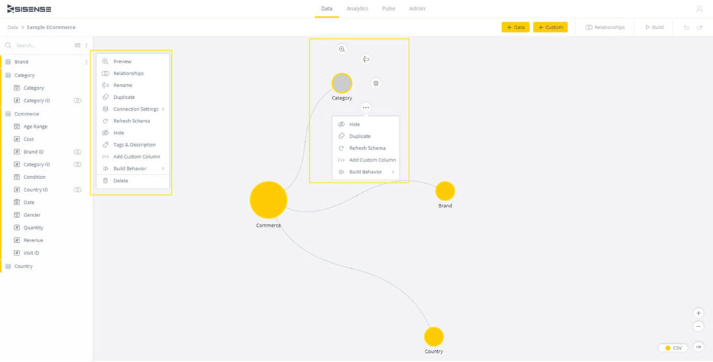
The purpose of creating a data model is to see the different tables you’re working with and how they’re related.
Depending on the type of app you’re developing, you might need to connect to multiple (static and live) data sources, which could be on-prem or in the cloud, in a data source managed by you or maintained by a third-party service provider. You also have the option to import data directly into Sisense or connect to it and combine them in the same dashboard to build an ElastiCube model or a Live model.

Once that’s done, you can cleanse and prepare the data for analysis. For example, if you’re building a data visualization to see which segment of your app users’ customer demographics contributes to sales the most, you might consider removing languages from your data model and keep metrics like country, gender, and age groups.
After identifying your data sources, you can connect to them and build the data model. The data source can be a file, relational database, or a web app. After connecting to a data source, choose the database tables you want to add to your data model and create relationships between tables by creating joins.
For example, if you have a Commerce table and a Brand table, you can create a join between the two to see Which brands generate the most revenue and How much revenue was generated for each brand.
Finally, build your data model either by using the Replace All option (if you’re building for the first time) or Changes Only option (if you’re modifying the data model).
Step #3: Create dashboards and filter data
To generate data visualizations for embedding into your app, you’ll need to create a dashboard. Start by selecting the data model you’re extracting data from.
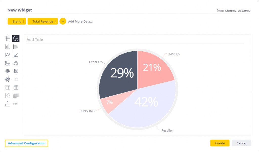
With Sisense, you can add widgets to your dashboard to create a data visualization. Select data fields from your data model and choose the formula you’d like to apply to it. For example, if you wanted to add a visualization for the total cost, you would select the Cost field and click Sum. You can also create custom, calculation-driven fields on the fly, using formulas.
Once you add a field to your dashboard, you’ll be able to choose how you want the data to appear in the widget. Different field types have different available options that let you choose how you visualize and analyze that data.

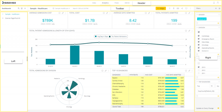
Here are some examples of widgets that you can add to your dashboards:
- Indicators and gauges are perfect for showing one KPI clearly, such as total revenue.
- Charts are great for visualizing trends or comparing different values for example the top five most popular products by revenue generated and customer age.
- Calendar heatmaps can visualize how many orders are shipped each day of the week – for example, light blue for fewer shipped orders and dark blue for a higher number of shipped orders.
- Pivot table widgets let you view granular, row-by-row data in an easy way to quickly extract key figures.
Sisense’s BloX widgets framework comes with a library of templates that you can use to create dashboards quickly.
You can create custom filters in your dashboard to let users view visualizations for specific data points. For example, if you wanted to give users the option to see total revenue, units sold, and gender breakdown in the United States market only, you could add a country filter.
Sisense lets you create dashboard filters and widget filters to your visualizations. In addition to this, you have the option to create multiple filters and dependent filters based on your use case. Dependent (or cascading) filters are perfect for when you’re working with a large volume of data and need to be able to see relevant options only.
Sisense’s natural language generation makes it easy for users to interpret data visualizations and identify correlations. For example, if you have a chart depicting gross sales by month and by product, the natural language interpreter might provide insights like:
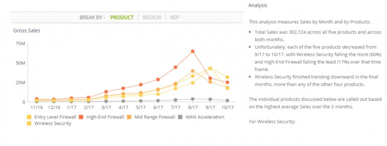

- Total sales was 302,724 across all five products and across both months.
- Wireless Security finished trending downward in the final months, more than any of the other four products.
Step #4: Embed analytics
Sisense lets you embed analytics into products in three different ways: Embed SDK, SisenseJS, and iframe. You can programmatically generate the embedded element using these technologies.
Embedding analytics using the Embed SDK is a simple two-step process where you start by embedding analytics into the parent application. Then, you simply pass a filter from the host app to the embedded analytics app. The Sisense JavaScript API can be used if you choose to embed analytics into your apps with Sisense.js.
You can try out different layout types on different devices. The embedded analytics are fully customizable and white-labelable.

Using Sisense Pulse, you can set up monitoring and get alerts when goals are met. For example, you can set a threshold value of, say, $500,000 for total revenue generated from Product A. This way, when the total revenue generated from the product reaches $500,000, you’ll receive an alert.
Or, if you’re monitoring profit over time for an ad campaign, you can set up an alert to get notified when you cross $10,000. You can also set it up to get alerts for filtered data, for instance, when profit over time exceeds $3,000 for the United States market.
You can also create automatic data alerts for anomalies and add alerts to filtered data. The platform lets you share alerts with different users and decide how they’re alerted, via email or mobile notification.
Sisense’s embedded analytics solution lets you export data to PDF. You can choose to export the dashboard as-is or a filtered dashboard. If you choose to export a filtered dashboard, the PDF will provide context as to which filters were applied to create the visualization.
So, for example, you can export a dashboard to only show marketing performance in the United States and United Kingdom from 2019 and 2020 for Product A, Product B, and Product C instead of all countries, all years, and all products. This is great for exporting large volumes of data set up to a specific context.
Conclusion
Businesses across all industries understand the value of using data and analytics to improve operations and grow their bottom line. Having the ability to integrate embedded analytics into your app can add more value to your product and give it a significant competitive edge.
Using Sisense’s Embedded Analytics solution, you can easily add more value to your products and empower users through self-service analytics.