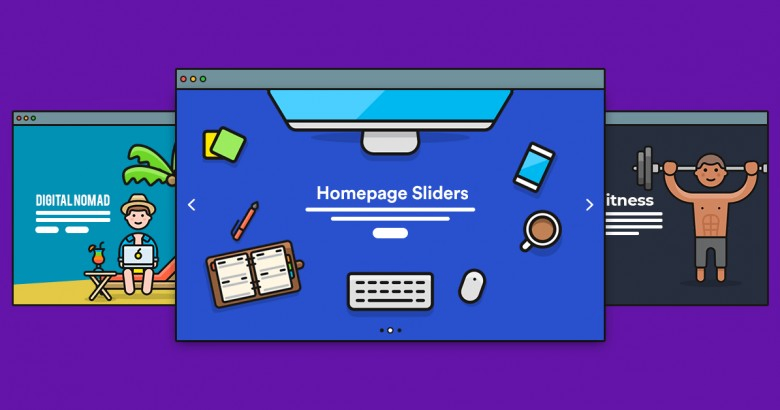
Fast and the omnipresent internet has revolutionized the way content is displayed in webpages of today’s online marketplaces. Most webpages have rich and engaging content to entice more traffic. With sliders and carousels, today’s webpages have become a veritable visual feast.
Many people are turned off by sliders, carousels or popups that are badly designed and ill-timed. These wonderful tools if not used properly become counterproductive for the online portal. Here are 6 reasons why sliders make your website suck-
-
The user feels less in control
The user has hardly any control over how long a slider plays. If the user is a slow reader, the message will not be read fully. Sometimes, if a large image is played in the background, it takes away the focus from the text.
The user will be forced to wait for the other slides to finish running to complete reading the first slide. This would create anxiety and may negatively affect a buying decision. To avoid this issue, some apps like the Shopify Revolution slider app have pause buttons to give the user more control.
-
Slow page load
Most users expect the homepage of a website to open in about 1-2 seconds. They abandon search if it takes more time to load. Google has incorporated load speed in its algorithm to generate results of a search.
Sliders use tons of data. They have a major effect on page load speeds. Their overuse will soon prove to become counterproductive.
-
Fractured content
Sliders help in saving real estate of your webpage. Since you can have an unlimited number of sliders on a webpage, websites rely on them to provide bulk messages.
When the message is split into different slides, users often get confused as they can see only one part of the message at a time. This will result in incomplete message delivery and will put off prospective buyers.
-
Loads of distraction
The human eye is conditioned to react to movement. Any fancy or elaborate animation is bound to distract the user. This will result in the message not getting across to the user. It is better to use animations judicially to make it engaging rather than distracting.
-
Rude and garish
Some sliders and carousels can be excessively aggressive. Many will consider them a rude and garish attempt to entice into making a sale. The discerning user will always skip pages with excessively aggressive sliders and pop-ups. Many people believe sliders are for people with fewer attention spans!
-
Sliders are confusing
Most sliders in many webpages when clicked lead to other webpages totally unrelated to what the user was browsing. This is a major turn off to most users. Not only does it waste valuable time, but it also confuses the user.
Instead of just adding a slider to increase the cool quotient, you would do well if you could use it strategically. Popular slider apps like the revolution slider app have numerous options to let the user control slide transition.
Make your sliders more effective by-
- making your clickable images lead to other pages on your website.
- ensuring that the text relevant and consistent with the image.
- have large next and previous navigation buttons to enable the user to navigate between slides easily
- add “read on” link if there is more information to be read
- ensure all sliders have a pause button for the user to read at his own pace.